Project overview
Problem
Family mums and workers lack the time to do instore shopping or want quality and affordable products.
Goal
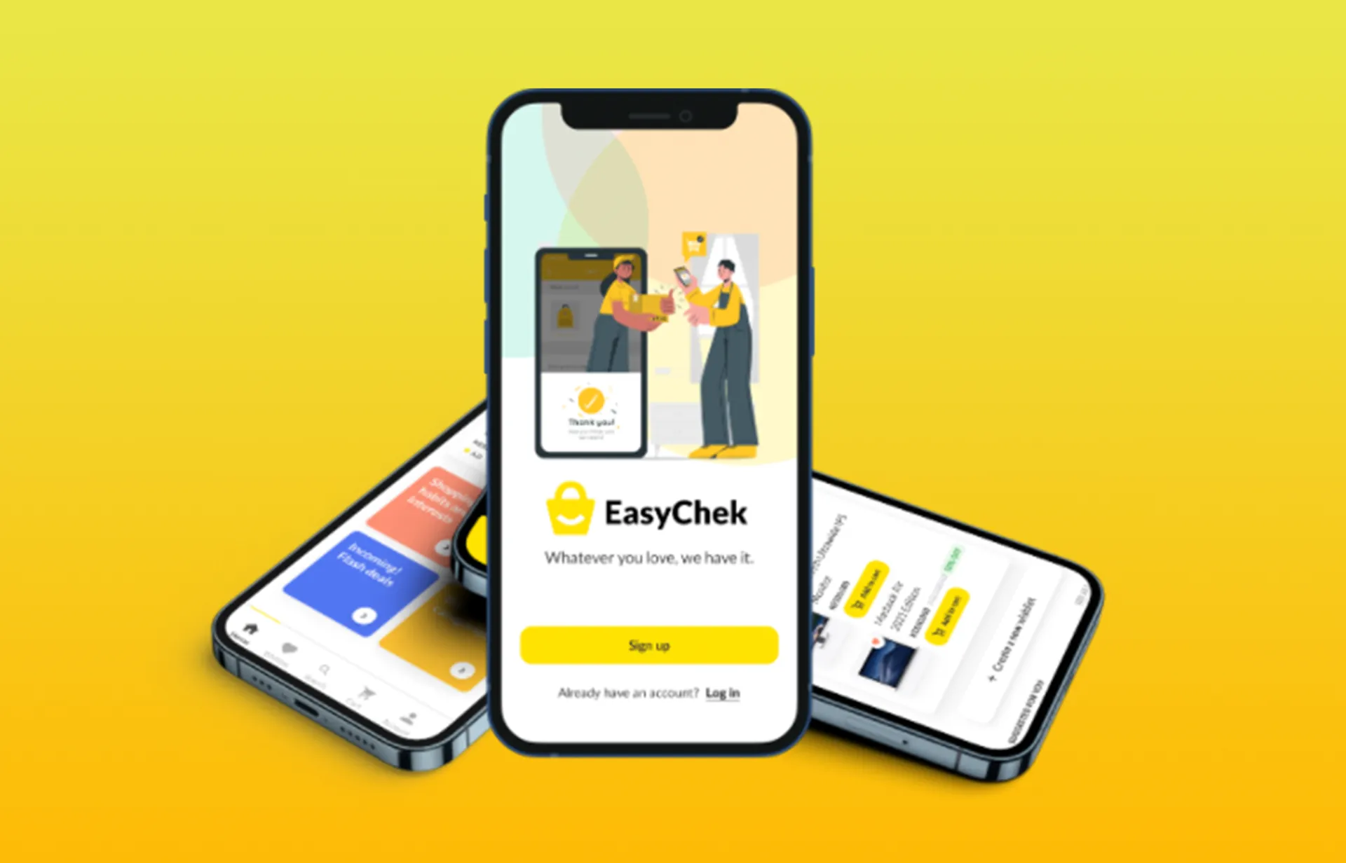
Design an app for Triple E , called EasyChek that allows users to easily and seamlessly order products which are delivered to their address
My role
UX designer rom UX designer of Triple E’ s EasyChek app from conception to delivery.
Responsibilities
Conducting interviews Conducting competitive audits, paper and digital wireframing, low and high-fidelity prototyping, conducting usability studies, accounting for accessibility, and iterating on designs.


