UI/UX
May 12, 2022

Alpha Homes – Real estate website

Background information

Alpha Homes is a premium real estate listing & directory site that offers quality apartments for sale and rent to its client’s site. The typical user is between 19-70 years old, and most users are college students or early career professionals. Alpha Home goal is to make finding a place to stay in a fun, fast, and easy for all types of users.

Project overview

Problem

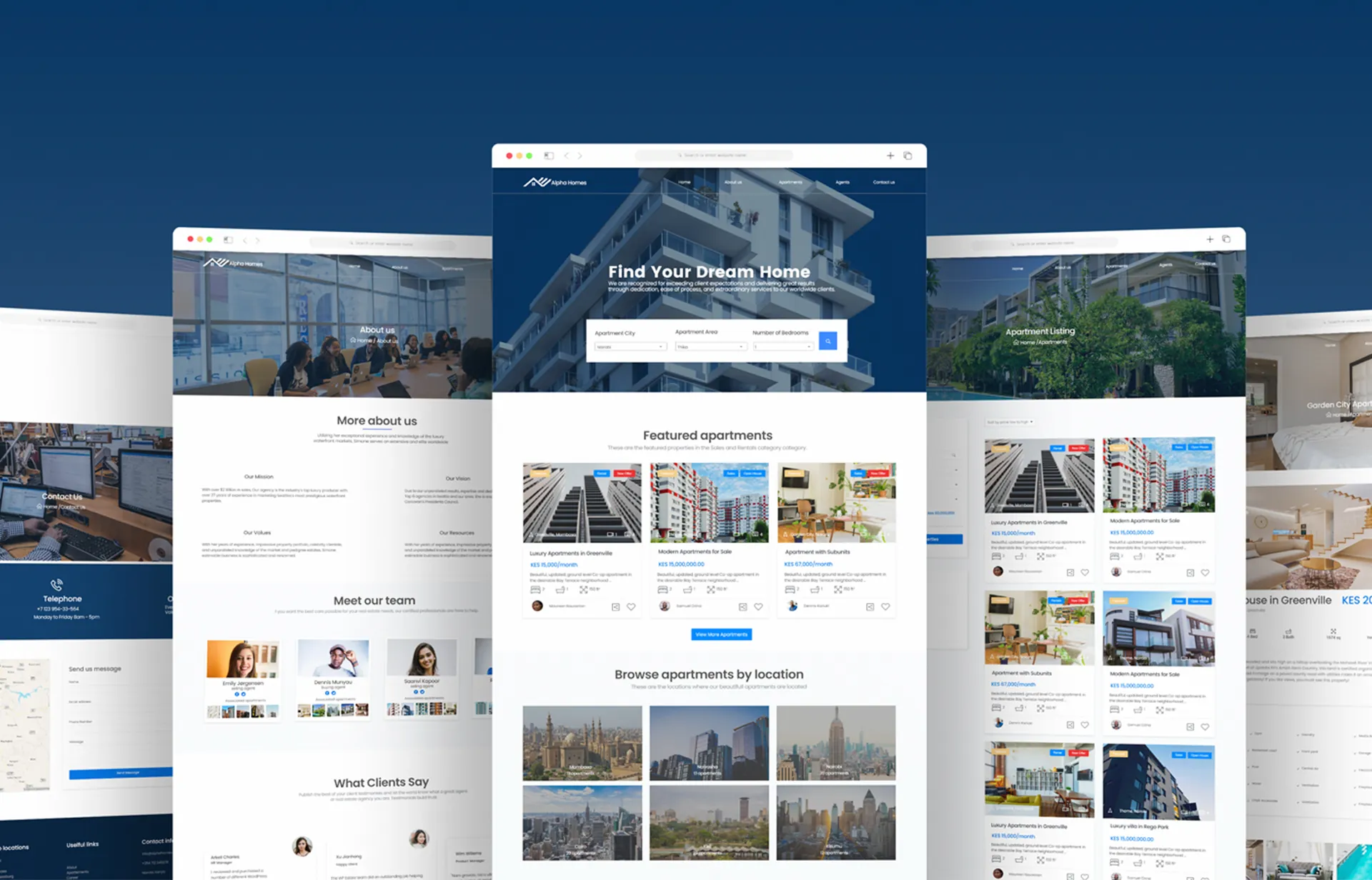
Available real estate websites have cluttered designs, inefficient systems for browsing through houses and apartments , and confusing apartment finding processes.

Goal

Design a resposnive relal estate website to be user friendly by providing clear navigation and offering a fast apartment finding process

My role

Lead UX designer in designing of Alpha Homes Website

Responsibilities

Conducting user research, paper and digital wireframing, low and high-fidelity prototyping, conducting usability studies, accounting for accessibility, iterating on designs and responsive design.

Understanding the user

User research

I conducted user interviews, which I then turned into empathy maps to better understand the target user and their needs. I discovered that many target users usually look for a better place when they are moving into new towns. However, many housing websites are overwhelming and confusing to navigate, which frustrated many target users. This caused a normally enjoyable and easy experience to become challenging for them, making the process of finding a house becoming
a hustle for them

Understanding the user

Pain points

Navigation

Real estate and housing website designs are often busy, which results in confusing navigation.

Components

Components, e.g., buttons do not have enough padding which makes item selection difficult, sometimes leading users to make mistakes.

Experience

Most of existing apps do not offer real-time order tracking of purchased products.

Understanding the user

User persona

user persona
Understanding the user

Information Architecture

Difficulty with website navigation was a primary pain point for users, so I used that knowledge to create a sitemap.My goal here was to make strategic information architecture decisions that would improve overall website navigation. The structure I chose was designed to make things simple and easy.

Home aprtments sitemap
Ideation

Paper wireframes/Sketching

I did a quick ideation exercise to come up with ideas for how to address gaps identified in the competitive audit. My focus was specifically on how the recent graduates can find and connect with mentors.

3_paper wireframes_home
paper wireframes
paper wireframes
Design

Digital wireframes

Moving from paper to digital wireframes made it easy to understand how the design could help address user pain points and improve the user experience. Prioritizing useful button locations and visual element placement on the home page was a key part of my strategy.

digital wireframes
Prototyping

Low fidelity prototype

o create a low-fidelity prototype, I connected all of the screens involved in the primary user flow of adding an item to the cart and checking out.
At this point, I had received feedback on my designs from members of my team about things like placement of buttons and page organization. I made sure to listen to their feedback, and I implemented several suggestions in places that addressed user pain points.

View lo-fi prototype

lo-fi prototype
UI Design

Style Guide

_styleguide
UI Design

Hi-fi Mockups

Portfolio mockup
Alpha Homes real estate website mockups
Prototyping

Hi-fi Prototype

The high-fidelity prototype followed the same user flow as the low fidelity prototype, including design changes made after the usability study.

View hi-fi prototype

hi-fi prototype